Matplotlib
Matplotlib is a really popular plotting library that really allows you to customize.
Most of the time, just use the functional approach.
import matplotlib.pyplot as plt
plt.plot()
For equal aspect ratio of plots, use
plt.gca().set_aspect('equal')However, if there are multiple plots, you can do
figure, axis = plt.subplots(2, 2) # 2 rows, 2 columns

plt.show()
plt.savefig(bbox_inches = "tight")
For imshow, the default origin is upper, which places the [0, 0] index of the array in the upper left corner of the Axes. The convention (the default) ‘upper’ is typically used for matrices and images.
fig, (ax1, ax2) = plt.subplots(1, 2, figsize=(20, 12), dpi=100)
fig.tight_layout()

# Adding sensor location
sns.scatterplot(x='x_sensor', y='y_sensor', data=adj_scaled_sensor_df, s=120, color='black', ax=ax1)
sns.scatterplot(x='x_sensor', y='y_sensor', data=adj_scaled_sensor_df, s=120, color='black', ax=ax2)

ax1.axis('off')
ax2.axis('off')
ax1.set_title("Title 1")
ax2.set_title("Title 2")
ax1.get_legend().remove()
ax2.get_legend().remove()
fig, (ax1, ax2) = plt.subplots(2, 1, figsize=(20, 10), dpi=100)
ax1.plot(robot_rssi_merged['y_robot'])
ax2.plot(robot_rssi_merged_using_time['y_robot'])
ax1.set_title("Robot-y Position aligned using Tag ID, Sequence Number and Time (Method #1)")
ax2.set_title("Robot-y Position aligned using Time (Method #2)")List of Plot Types
Using the Blues cmap makes it look pretty nice.
https://matplotlib.org/stable/plot_types/index.html
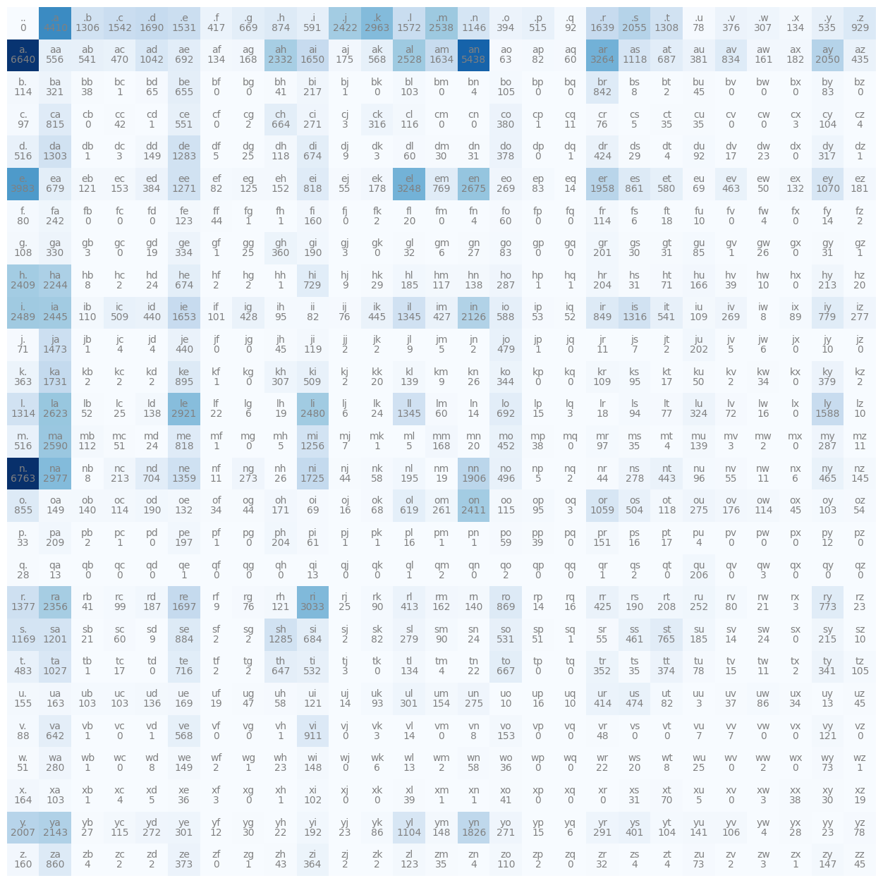
Some Really nice graphs
import matplotlib.pyplot as plt
%matplotlib inline

plt.figure(figsize=(16,16))
plt.imshow(N, cmap='Blues')
for i in range(27):
	for j in range(27):
		chstr = itos[i] + itos[j]
		plt.text(j, i, chstr, ha="center", va="bottom", color='gray')
		plt.text(j, i, N[i,j].item(), ha="center", va="top", color='gray')
plt.axis('off')
Generates the graph below, super nice! Use plt.axis('off') so you don’t see the axes.
From the Optimal Transport notebook, originally here
# Compute the Cost Matrix between bakeries and Cafes
C = ot.dist(bakery_pos, cafe_pos)
ax = pl.subplot(122)
im = pl.imshow(C, cmap="coolwarm")
pl.title('Cost matrix')
cbar = pl.colorbar(im, ax=ax, shrink=0.5, use_gridspec=True)
cbar.ax.set_ylabel("cost", rotation=-90, va="bottom")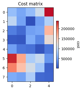
# Plot the matrix and the map
f = pl.figure(3, (14, 7))
pl.clf()
pl.subplot(121)
pl.imshow(Imap, interpolation='bilinear')  # plot the map
for i in range(len(bakery_pos)):
    for j in range(len(cafe_pos)):
        pl.plot([bakery_pos[i, 0], cafe_pos[j, 0]], [bakery_pos[i, 1], cafe_pos[j, 1]],
                '-k', lw=3. * ot_emd[i, j] / ot_emd.max())
for i in range(len(cafe_pos)):
    pl.text(cafe_pos[i, 0], cafe_pos[i, 1], labels[i], color='b', fontsize=14,
            fontweight='bold', ha='center', va='center')
for i in range(len(bakery_pos)):
    pl.text(bakery_pos[i, 0], bakery_pos[i, 1], labels[i], color='r', fontsize=14,
            fontweight='bold', ha='center', va='center')
pl.title('Manhattan Bakeries and Cafés')

ax = pl.subplot(122)
im = pl.imshow(ot_emd)
for i in range(len(bakery_prod)):
    for j in range(len(cafe_prod)):
        text = ax.text(j, i, '{0:g}'.format(ot_emd[i, j]),
                       ha="center", va="center", color="w")
pl.title('Transport matrix')

pl.xlabel('Cafés')
pl.ylabel('Bakeries')
pl.tight_layout()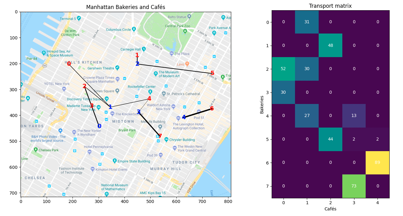
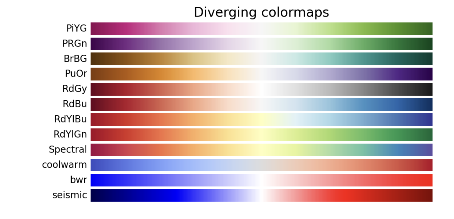
Color Scheme
cmap options
Seaborn
Wrapper around Matplotlib
Plotly
Use this only if you want to have the graph interactive, else matplotlib seems like a great option. I think I will still to matplotlib, and customize the graphs so it looks great.