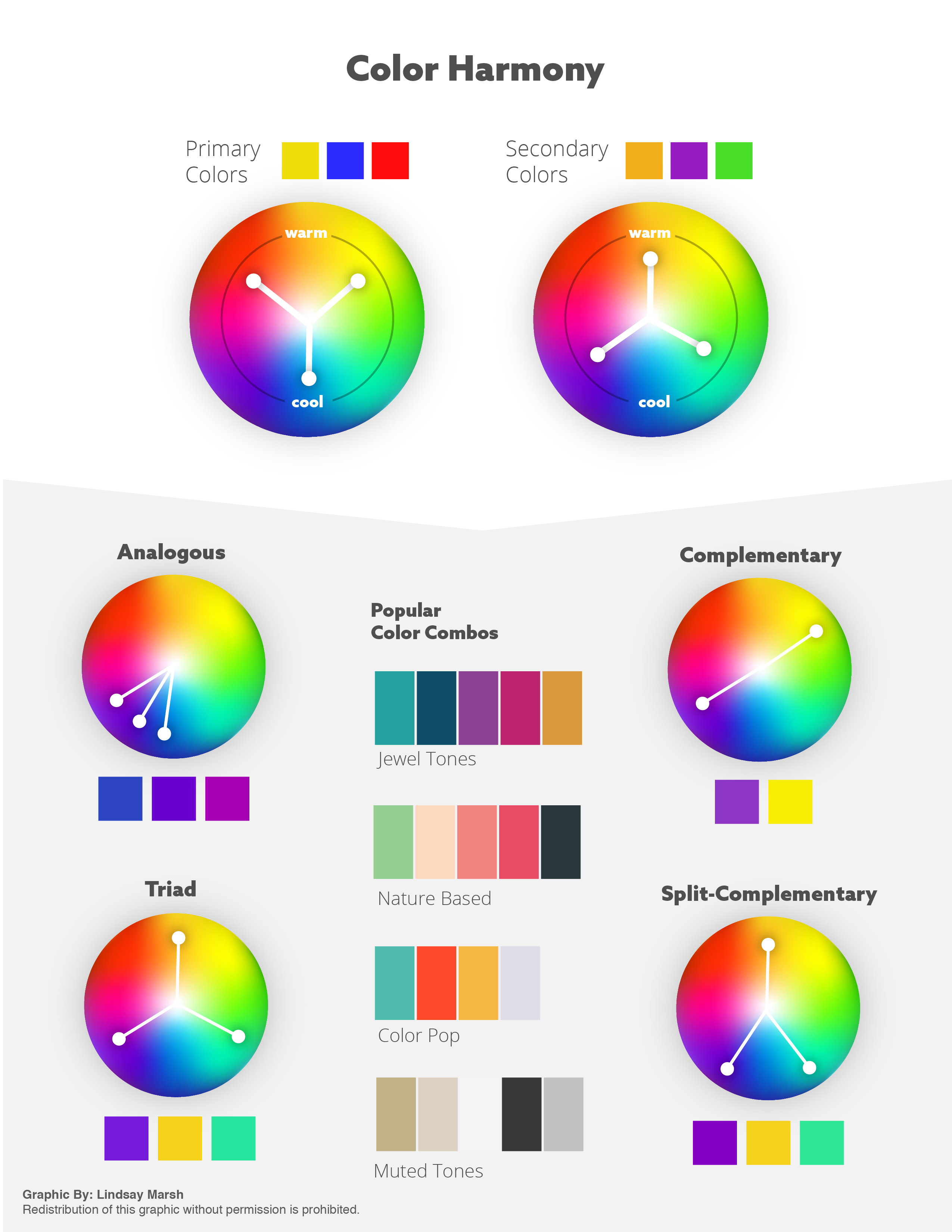
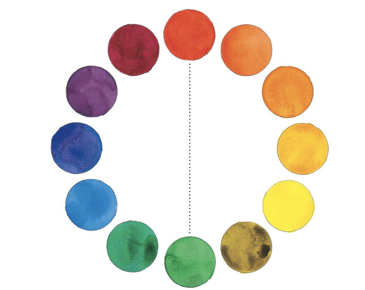
Color Scheme
Choosing and applying a color scheme (or a selection of related colors) in your painting can help you achieve unity, harmony, or dynamic contrasts.
Complementary Colors
Complementary colors are opposite each other on the color wheel. When placed adjacent to each other in a painting, complements make each other appear brighter. When mixed, they have the opposite effect, neutralizing (or graying) each other.
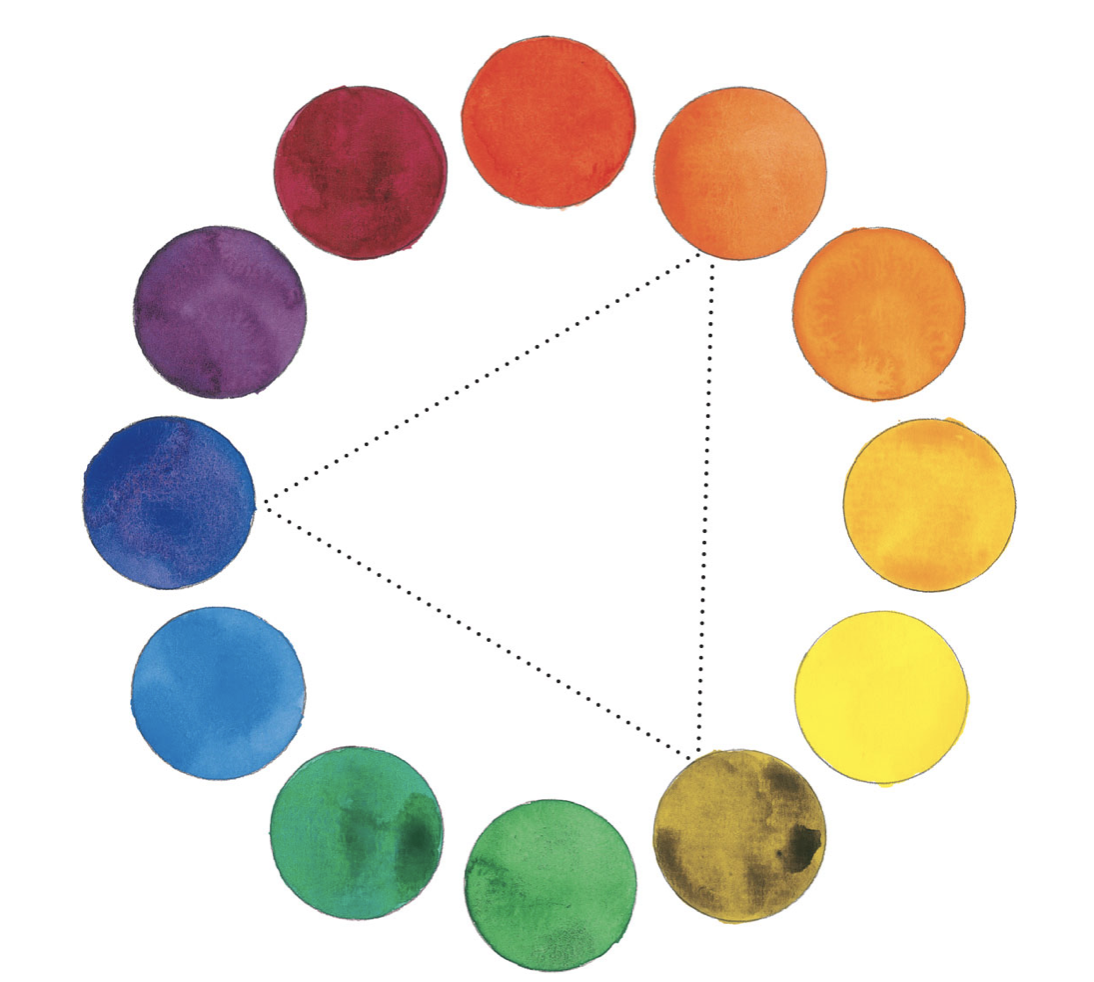
Triadic Color Scheme
This scheme consists of three colors that form an equilateral triangle on the color wheel.
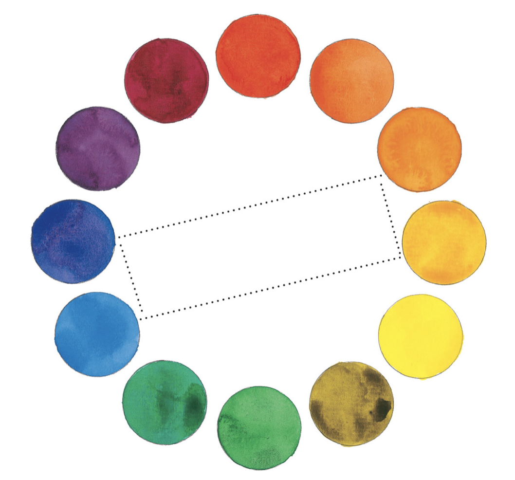
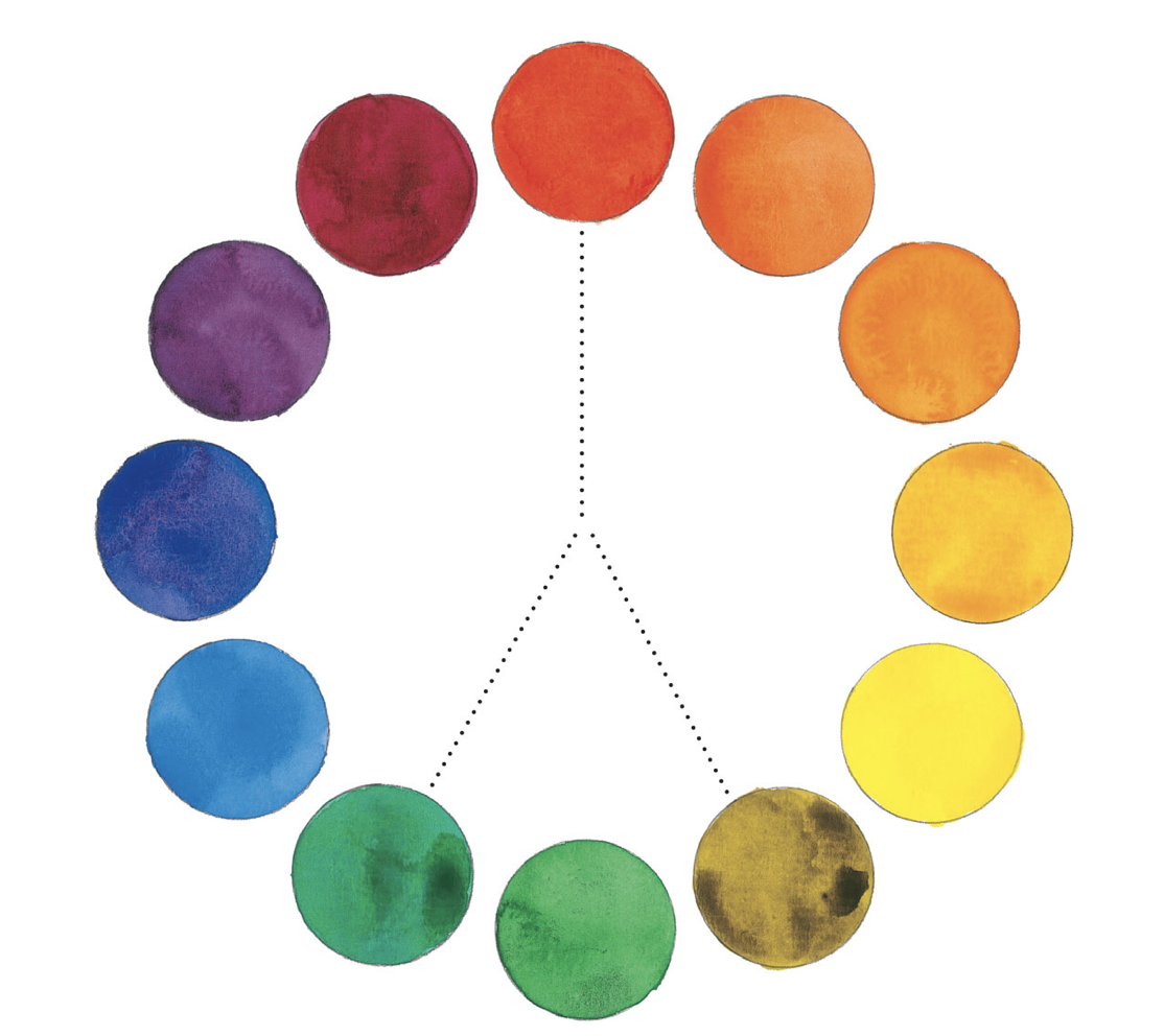
Tetradic / Double Complementary Color Scheme
Four colors that form a square or a rectangle on the color wheel create a tetradic color scheme. This color scheme includes two pairs of complementary colors, such as orange and blue and yellow-orange and blue-violet (shown above).
Analogous Color Schemes
Analogous colors are adjacent (or close) to each other on the color wheel. Analogous color schemes are good for creating unity within a painting because the colors are already related. You can do a tight analogous scheme (a very small range of colors) or a loose analogous scheme (a larger range of related colors, like blue-violet-red).
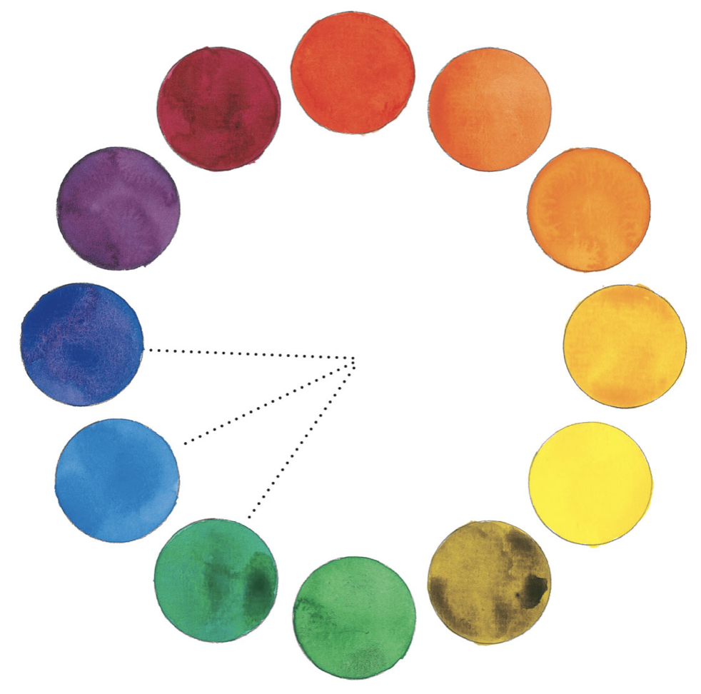
Split-Complementary Color Schemes
This scheme includes a main color and a color on each side of its complementary color.
Summary
Good summary from a Graphic Design course I took.